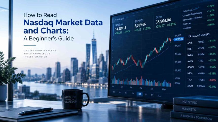
The first time you open a Nasdaq stock chart, you might think, “What am I looking at?”
There’s a price at the top. Red and green candles move across the screen. Numbers keep changing. Under the chart, you see things like volume, open, previous close, and 52-week high.
It can look like a lot.
The good news is that you don’t need to understand every number on the screen. You just need to know which numbers matter, what they mean, and how they fit together.
That’s what we’ll do here.
Imagine you’re looking at a stock and see that it is up 5% today. Your first thought might be, “That’s good.”
Maybe.
Then you look a little closer.
The stock opened at $100 and is now at $105. Earlier, it reached $108 before falling back. Trading volume is much higher than usual. Then you change the chart from “today” to “one year” and notice the stock is still well below where it was six months ago.
Now the picture looks different.
That’s the real skill behind reading market data: putting the numbers into context.
In this guide, we’ll take it one step at a time. You’ll learn how to read a Nasdaq stock quote, understand the main numbers, follow a price chart, make sense of volume, and spot basic trends.
No finance degree required. No need to memorize a long list of technical terms.
By the end, when you open a Nasdaq chart, you should be able to look at it and think, “Okay, I know what I’m seeing here.”
First, What Is Nasdaq?
Before we look at charts, let’s clear up one common point.
Nasdaq is a stock exchange where shares of publicly traded companies can be bought and sold. It is also the name used for several well-known market indexes, including the Nasdaq Composite and Nasdaq-100.
You’ll often hear people say that a company is “on the Nasdaq.” That simply means its shares are listed for trading on the Nasdaq exchange.
You may also hear people say, “The Nasdaq is up today.”
In that case, they are usually talking about a Nasdaq index rather than one individual company.
This distinction matters because an index and an individual stock are not the same thing.
A stock chart shows the price movement of one company. An index tracks the performance of a group of companies according to the rules of that index.
For a beginner, you don’t need to get too deep into the differences yet. Just remember:
Stock = one company.
Index = a group of stocks measured together.
The Five Questions to Ask When You Open a Nasdaq Chart
Here’s a simple way to make all those numbers easier to understand.
Whenever you open a stock quote or chart, ask five questions:
- Where is the price now?
- Where did it start?
- How far has it moved?
- How much trading activity is there?
- What story does the chart tell?
You can use these five questions almost anywhere you see market data.
Let’s take them one at a time.
1. Where Is the Price Now?
The easiest place to start is the current price.
If a stock is trading at $150, that means the latest quoted trading price is around $150 per share.
You’ll usually see another number beside it showing how much the stock has moved.
For example:
| Market data | Example |
|---|---|
| Current price | $150 |
| Daily change | +$5 |
| Percentage change | +3.45% |
The $5 tells you the price has moved up by $5 compared with the reference price being shown.
The 3.45% tells you how large that move is relative to the starting price.
Why show both?
Because $5 means something different for a $20 stock than it does for a $500 stock.
That’s why percentage change is often useful when comparing price moves.
What I’d look at first
Don’t stop at the big green “+3.45%.”
Ask yourself: “3.45% compared with what?”
That one question can prevent a lot of confusion.
2. Where Did the Stock Start?
Now look at the open and previous close.
The previous close is the price at which the stock finished its last regular trading session.
The open is the price at which the stock began the current regular trading session.
Suppose a stock closed yesterday at $100 and opened today at $104.
That tells you something happened between those two points.
The stock started today $4 higher than yesterday’s close.
You may hear this described as a gap up.
The opposite is a gap down.
If yesterday’s close was $100 and today’s open was $96, the stock opened below where it finished the previous session.
You don’t need to assume that either move is automatically good or bad.
The useful thing is simply to notice the difference.
3. How Far Has the Stock Moved?
This is where the day’s high and low become useful.
Imagine you see:
- Current price: $105
- Day’s high: $110
- Day’s low: $98
Now you know the stock has moved through a fairly wide range during the day.
It started lower, climbed as high as $110, and is currently at $105.
That gives you more information than the current price alone.
The same idea applies to the 52-week high and low.
These numbers show the highest and lowest trading prices over the past 52 weeks.
Suppose a stock is trading at $105, with:
- 52-week high: $130
- 52-week low: $70
Suddenly, $105 has more context.
It isn’t close to the yearly high, but it also isn’t close to the yearly low.
One important warning
A 52-week high is not a target.
A 52-week low is not automatically a bargain.
This is an easy mistake for beginners to make.
You might see a stock trading near its 52-week low and think, “It has fallen a lot, so it must be cheap.”
But a falling stock can keep falling.
Likewise, a stock near its 52-week high isn’t necessarily overpriced simply because it has reached a high.
The number tells you where the price has been. It does not tell you where the price should go next.
4. How Much Trading Activity Is There?
Now we get to volume.
Volume is simply the number of shares traded during a particular period.
If a stock has traded 2 million shares today, its volume is 2 million shares.
At first, that number might not mean much.
The useful question is:
“Is that a lot for this stock?”
Suppose a stock normally trades 500,000 shares a day but suddenly trades 5 million.
That is a big change in activity.
Something may be attracting more attention.
Perhaps the company released earnings. Maybe there was important news. Maybe the whole market moved sharply.
Volume doesn’t tell you exactly why something happened. But it can tell you that more trading activity is happening than usual.
That makes it worth looking closer.
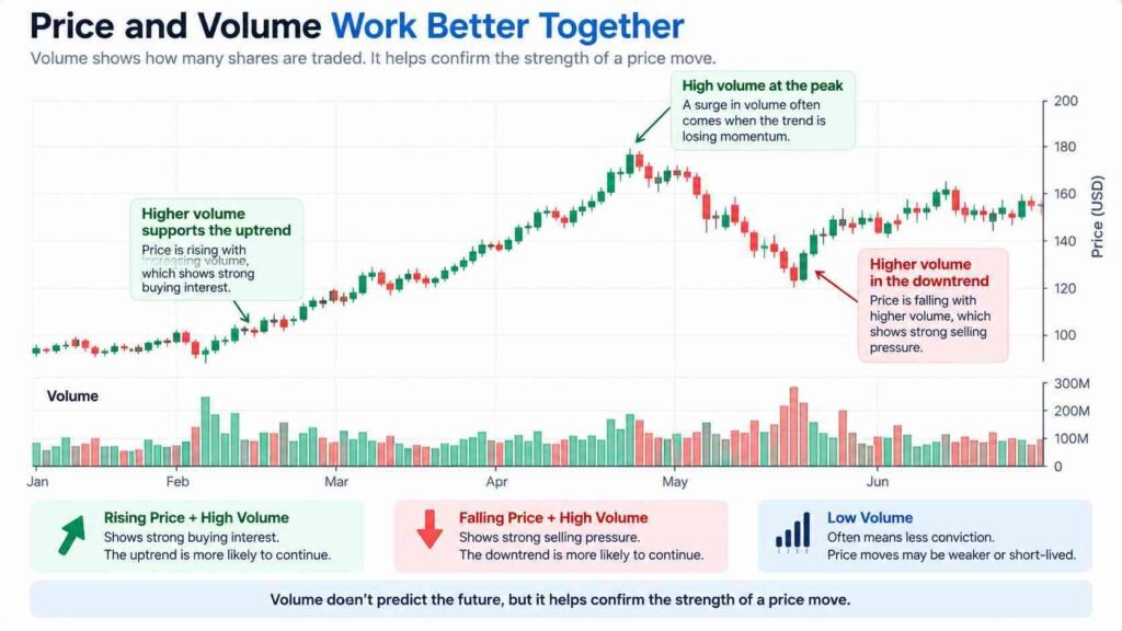
Price and volume work better together
This is one of the most useful ideas for beginners.
Imagine a stock rises from $100 to $110.
That tells you the price went up.
Now imagine you also see unusually high trading volume.
You have another piece of information: the move happened while many more shares than usual were changing hands.
You still cannot say, “The stock will keep going up.”
But you have a better picture of what happened.
Price tells you what happened to the stock. Volume tells you how much trading activity was behind it.
5. What Story Does the Chart Tell?
Now it’s time to look at the chart itself.
At first, charts can look like a collection of lines and colors.
Don’t try to understand everything at once.
Start by asking one simple question:
Is the price generally moving up, down, or sideways?
If the chart keeps making higher highs and higher lows over time, you may be looking at an upward trend.
If it keeps making lower highs and lower lows, the general direction is downward.
If the price keeps moving within roughly the same area, the stock may be moving sideways.
You don’t need to give the pattern a fancy name immediately.
Just look at the bigger picture.
And this is where your timeframe matters.
The Same Stock Can Look Completely Different
Imagine a stock has fallen 3% today.
On a one-day chart, the move may look serious.
But switch to a one-year chart and you might see that the stock is still up 40% over the year.
Nothing about the numbers changed.
Your view changed.
This is why looking at only one timeframe can be misleading.
Short timeframes show small movements more clearly.
Longer timeframes help you see the bigger direction.
For a beginner, it can be helpful to start with a longer timeframe before zooming in.
Zoom out first. Zoom in second.
That simple habit can change the way you read charts.
What Are Those Red and Green Candles?
If you’ve opened a modern stock chart, you’ve probably seen candlesticks.
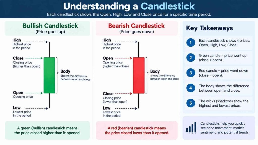
Each candle represents price movement during a specific period.
Depending on the timeframe, one candle might represent one minute, one hour, one day, or another period.
A basic candlestick gives you four important prices:
- Open: where the price started during that period.
- Close: where the price finished.
- High: the highest price reached.
- Low: the lowest price reached.
The thick part of the candle is called the body.
The thin lines extending above or below it are often called wicks or shadows.
A simple example makes this easier.
Suppose a daily candle shows:
- Open: $100
- High: $108
- Low: $97
- Close: $106
The stock started the day at $100, climbed as high as $108, dropped as low as $97, and finished at $106.
The candle gives you all of that information in one small shape.
What do the colors mean?
Usually, a green candle means the closing price was higher than the opening price.
A red candle usually means the closing price was lower than the opening price.
Different chart platforms can use different colors or settings, so it’s worth checking the chart’s legend if you’re unsure.
The important part is not the color itself.
It’s the relationship between the open, high, low, and close.
Why the Wicks Matter
The candle body gets most of the attention, but don’t ignore the wicks.
A long upper wick tells you the price reached a higher level but moved back down before the period ended.
A long lower wick tells you the price fell to a lower level but then recovered.
That can be useful information about what happened during that period.
But here’s where it’s easy to go too far.
One candle does not tell you the future.
You might see a shape that looks important and immediately think, “This must mean the stock is about to rise.”
Not necessarily.
Charts give you clues. They do not give you guarantees.
Support and Resistance: Keep It Simple
You’ll eventually come across two common chart terms: support and resistance.
You can think of support as an area where a stock has often found buying interest after falling.
Resistance is an area where the stock has often struggled to move higher.
For example, suppose a stock repeatedly moves toward $100, falls, and then climbs again.
You might start watching the $100 area as a possible support level.
If it repeatedly reaches $120 and then falls back, traders may watch $120 as a possible resistance area.
Notice the wording: possible.
These aren’t walls that the price cannot cross.
A stock can break below support or above resistance.
The point is simply to identify price areas that have mattered before.
A Simple Example: Putting Everything Together
Let’s say you open a hypothetical Nasdaq stock and see this:
| Data | Value |
|---|---|
| Current price | $105 |
| Previous close | $100 |
| Open | $102 |
| Day’s high | $110 |
| Day’s low | $99 |
| 52-week high | $130 |
| 52-week low | $70 |
| Volume | 4.5 million |
How would you read it?
Start with the five questions.
Where is the price now?
The stock is at $105.
Where did it start?
It opened at $102, compared with yesterday’s close of $100.
How far has it moved?
During the day, it traded between $99 and $110 and is now at $105.
How much activity is there?
Volume is 4.5 million shares. Whether that’s high or low depends on the stock’s normal trading volume, so you’d compare it with its usual activity.
What story does the chart tell?
That depends on the timeframe. If the longer-term chart shows the stock rising steadily, today’s move might simply be part of that trend. If the longer-term chart shows a large decline, today’s gain may look very different.
See what happened?
We didn’t need twenty indicators.
We simply put the basic information together.
The Mistake of Looking at One Number
This is probably the biggest lesson for a new investor.
One number rarely tells the whole story.
A stock can be up 10% today and still be down heavily over the past year.
A stock can be near its 52-week low and still fall further.
A stock can have high volume without the price making a large move.
A stock can break above a level and then fall back below it.
Context changes the meaning of the number.
So when something on a chart catches your attention, resist the urge to make a quick conclusion.
Instead, ask:
“What else should I look at?”
That question will take you much further than trying to predict every price move.
Five Things Beginners Should Check
When you open a Nasdaq stock page, you can use this quick checklist:
- Current price: Where is the stock trading now?
- Daily change: How much has it moved today?
- Open and previous close: Where did today’s session start compared with yesterday?
- High, low, and volume: How wide was the move, and how active was trading?
- Chart and timeframe: What does the bigger picture look like?
Once those make sense, you can start exploring more advanced tools such as moving averages, relative strength indicators, and other technical indicators.
But there’s no rush.
Understanding the basics well is more useful than collecting a screen full of indicators you don’t understand.
What Market Charts Can and Cannot Tell You
A chart can show you what has happened to a stock’s price.
It can help you see trends, price ranges, trading activity, and changes over time.
What it cannot do is promise what happens next.
This is worth saying clearly because financial charts can create a false sense of certainty.
A pattern may have appeared many times before, but that doesn’t mean the next occurrence will produce the same result.
News can change a company’s outlook.
Economic conditions can change.
Investor expectations can change.
And sometimes the market simply moves in a way nobody expected.
So use charts as a way to understand market behavior, not as a crystal ball.
You Don’t Need to Read Everything
There’s a temptation, especially when you’re new, to learn every term you see.
You don’t have to.
Start with the basics.
Learn what the price means. Understand the open and previous close. Know how to read the day’s high and low. Understand volume. Learn how to change the timeframe and read a basic candlestick.
Then practice.
Open a few Nasdaq stocks and spend five minutes looking at their charts.
Ask the same five questions each time.
After a while, the numbers that once looked like noise will start to tell a story.
And that is really what reading a market chart is about.
Not predicting every move. Not finding a magic signal. Just learning to look at the information, understand what it says, and put it in the right context.
Once you can do that, a Nasdaq chart stops looking like a wall of numbers.
It starts looking like information you can actually use.
Final Thought
The best thing you can do as a beginner is slow down.
You don’t need to know where a stock will be tomorrow.
Start by understanding where it is today, where it came from, how much it has moved, how active trading has been, and what the bigger chart looks like.
Five simple questions.
That’s enough to turn a confusing screen into something you can actually read.